Nuqta A'l Satr
Headquarters
UAE
Services
Brand Identity & Strategy
Industry
Podcast
Timeline
2 weeks
Year
2025
Project
Nuqta A'l Satr is a podcast founded by Rania Barghout, Lebanese TV presenter and host of Kalam Nawaem on MBC, dedicated to Arab women navigating pivotal life transitions. Rania brings two decades of broadcast storytelling into an intimate audio format, creating space for voices rarely heard in mainstream media: women mid-sentence in the most defining chapter of their lives.
Challenge
Arab women's stories exist in abundance. What's rare is a platform designed to hold them with the weight they deserve. The podcast space, particularly in the Arab world, tends toward either polished lifestyle content or academic discourse, leaving a significant gap for storytelling that is both culturally rooted and unfiltered. Rania Barghout arrived with two decades of broadcast credibility, a loyal audience, and a clear mission, but no visual language to match. The identity needed to honor her established presence while signaling something new: a more intimate, unguarded conversation than television ever allowed.
Solution
Our approach drew from the tension embedded in the brand's name itself: a nuqta (dot) and a satr (line), the smallest elements of Arabic script, and yet the ones that change everything. A misplaced dot shifts meaning entirely. A line connects what would otherwise remain separate. We built the entire identity around this metaphor: small gestures of precision that carry enormous consequence. The result is a visual system that feels both scholarly and intimate, structured enough to signal authority, open enough to invite vulnerability.
Design Process
Osea's creative process began with a deep read of the platform's content pillars and archetype framework, the Sage-Storyteller. From there, we developed a moodboard that mapped the intersection of Arabic calligraphic heritage and contemporary minimalism before moving into identity development. Given the two-week timeline, phases ran in tight sequence: discovery and moodboard in the first three days, logo and color system through the end of week one, typography and collaterals through week two. The client received a complete brand guidelines document covering all visual and tonal standards.

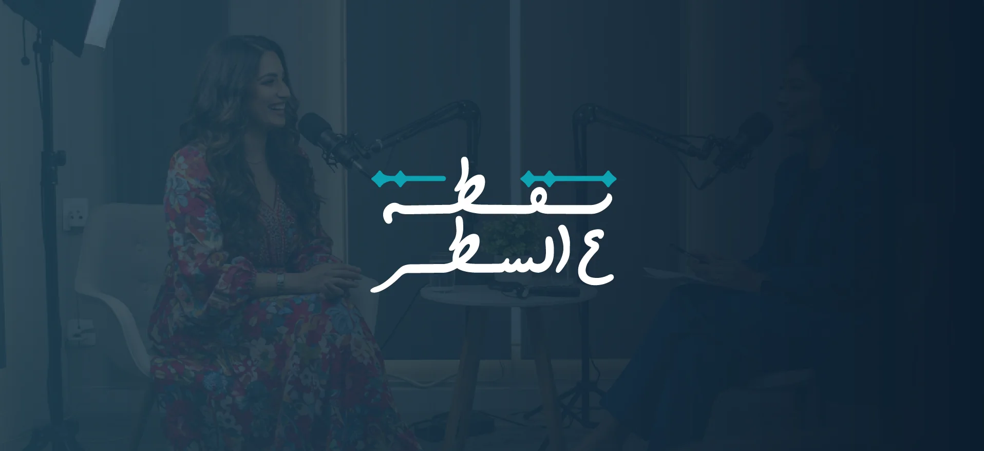
Logo Design
The primary mark fuses Arabic calligraphic artistry with deliberate minimalism. The dots, nuqat, are not decorative; they are the conceptual spine of the mark, representing the individual voices the platform amplifies. The connecting line beneath them mirrors the satr: the thread of continuity that binds those voices into something larger. Together they form a symbol that reads as both letterform and icon. The mark scales cleanly from podcast cover artwork to billboard format, maintaining legibility and emotional weight at every size without relying on color to carry its meaning.

Color Palette
The palette was built around contrast and intention, the same values the platform asks of its guests. Russian Violet anchors the system with depth and authority, the color of late-night conversations that change your perspective. Moonstone cuts through as the renewal tone: clarity after difficulty, the breath after the hard sentence. Anti-Flash White provides the system's breathing room, keeping the identity from collapsing under its own seriousness. Eerie Black grounds everything, precise, enduring, unhurried. Together they create a palette that feels neither soft nor harsh, but honest.

Typography
Halls Khodkar leads the system for titles and prominent text. Its ornate calligraphic strokes carry the emotional register of handwritten storytelling, grounding each headline in the cultural heritage the platform holds dear. Beiruti handles everything structural: subheadings, body copy, functional text. Its geometric precision and clean weight range ensure that long-form content remains readable without losing character. The pairing creates a voice that is simultaneously ancient and clear, like listening to someone who has studied deeply and speaks plainly.

Podcast Episode Covers
A cohesive episode cover system ensures Nuqta A'l Satr holds strong visual consistency across every listening platform. Each cover carries the primary mark, the Russian Violet and Moonstone palette, and Halls Khodkar's calligraphic weight, so every episode feels like an extension of the same voice, not a standalone graphic. The system accommodates guest portraits, thematic imagery, and text-only formats without losing identity coherence. On a shelf of thumbnails, Nuqta A'l Satr is immediately recognizable, because every cover is built from the same intentional foundation.

Brand Collaterals
Strategic physical and digital touchpoints extend the brand across every surface where Nuqta A'l Satr appears. The podcast cover and episode cover system translates the identity into the primary discovery context, where a listener's first impression is formed in under a second. The business card carries the mark into professional exchanges with the same tonal gravity as the platform itself. Billboard and rollup formats push the identity into physical space, testing whether the visual system holds its authority at scale. It does: the mark was designed for exactly this range.


